In this guide we will learn how to implement button functionality using material button widgets.
- Basic Widgets or Classes to implement button functionality
- FlatButton Class
- RaisedButton Class
- IconButton Class
- FloatingActionButton Class
- Advanced Widgets or Classes to implement button functionality
- ButtonBar
- DropdownButton
- PopupMenuButton
In this guide, we will cover all the material button widgets listed on the official flutter docs - Material Button Documentation
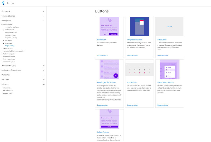 |
|---|
| Flutter Material Button Documentation |
Let us start with the simplest way to implement buttons in flutter
1. FlatButton Class - Documentation
Also refer official class documentation with this guide to deeply understand the concept.
A flat button is a text label displayed on a zero elevation Material widget.
FlatButton Class Constructor
FlatButton({Key key, @required VoidCallback onPressed, ValueChanged<bool> onHighlightChanged, ButtonTextTheme textTheme, Color textColor, Color disabledTextColor, Color color, Color disabledColor, Color focusColor, Color hoverColor, Color highlightColor, Color splashColor, Brightness colorBrightness, EdgeInsetsGeometry padding, ShapeBorder shape, Clip clipBehavior, FocusNode focusNode, bool autofocus: false, MaterialTapTargetSize materialTapTargetSize, @required Widget child })
Required Parameters
- ‘onPressed’ parameter is required
- ‘child’ parameter is required
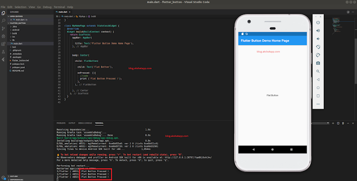 |
|---|
| FlatButton Implementation |
lets add some more parameters or properties : refer official class documentation for property list
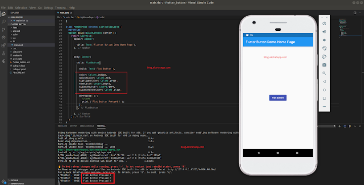 |
|---|
| FlatButton Color Parameters |
How to disable a button ?
Set onPressed VoidCallback to ‘null’
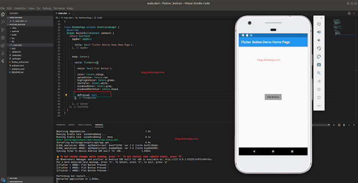 |
|---|
| FlatButton Disabled |
FlatButton.icon Constructor
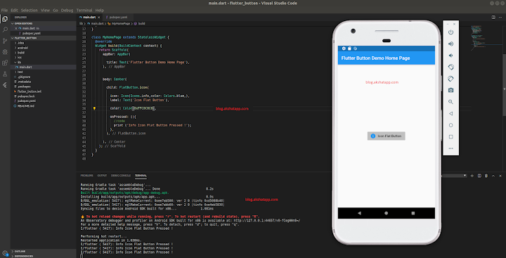 |
|---|
| FlatButton.icon Constructor |
2. RaisedButton Class - Documentation
Also refer official class documentation with this guide to deeply understand the concept.
Button with elevation
RaisedButton Class Constructor
RaisedButton({Key key, @required VoidCallback onPressed, ValueChanged<bool> onHighlightChanged, ButtonTextTheme textTheme, Color textColor, Color disabledTextColor, Color color, Color disabledColor, Color focusColor, Color hoverColor, Color highlightColor, Color splashColor, Brightness colorBrightness, double elevation, double focusElevation, double hoverElevation, double highlightElevation, double disabledElevation, EdgeInsetsGeometry padding, ShapeBorder shape, Clip clipBehavior, FocusNode focusNode, bool autofocus: false, MaterialTapTargetSize materialTapTargetSize, Duration animationDuration, Widget child })
Required Parameters
- ‘onPressed’ parameter is required
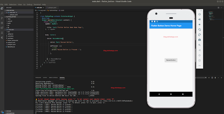 |
|---|
| RaisedButton Implementation |
lets add some more parameters or properties : refer official class documentation for property list
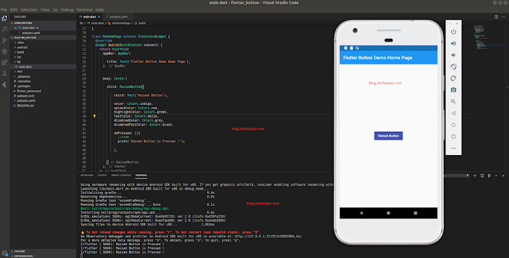 |
|---|
| RaisedButton Color Parameters |
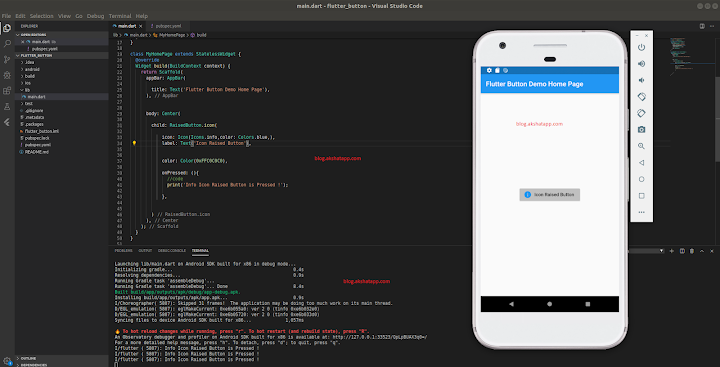
RaisedButton.icon Constructor
 |
|---|
| RaisedButton.icon Constructor |
3. IconButton Class - Documentation
Also refer official class documentation with this guide to deeply understand the concept.
IconButton Class Constructor
IconButton({Key key, double iconSize: 24.0, EdgeInsetsGeometry padding: const EdgeInsets.all(8.0), AlignmentGeometry alignment: Alignment.center, @required Widget icon, Color color, Color focusColor, Color hoverColor, Color highlightColor, Color splashColor, Color disabledColor, @required VoidCallback onPressed, FocusNode focusNode, bool autofocus: false, String tooltip })
Required Parameters
- ‘onPressed’ parameter is required
- ‘icon’ parameter is required
 |
|---|
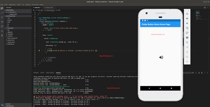
| IconButton Class Implementation |
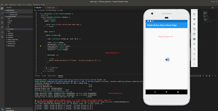
lets add some more parameters or properties : refer official class documentation for property list
 |
|---|
| IconButton Color Parameters |
4. FloatingActionButton Class - Documentation
Also refer official class documentation with this guide to deeply understand the concept.
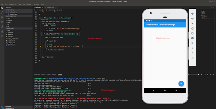
- floating action button is a circular icon button that hovers over content to promote a primary action.
- Use at most single floating action button per screen
FloatingActionButton Class Constructor
FloatingActionButton({Key key, Widget child, String tooltip, Color foregroundColor, Color backgroundColor, Color focusColor, Color hoverColor, Color splashColor, Object heroTag: const \_DefaultHeroTag(), double elevation, double focusElevation, double hoverElevation, double highlightElevation, double disabledElevation, @required VoidCallback onPressed, bool mini: false, ShapeBorder shape, Clip clipBehavior: Clip.none, FocusNode focusNode, bool autofocus: false, MaterialTapTargetSize materialTapTargetSize, bool isExtended: false })
Required Parameters
- ‘onPressed’ parameter is required
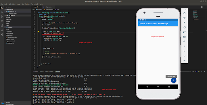
Scaffold has a floatingActionButton Parameter - Scaffold Constructor Documentation
 |
|---|
| FloatingActionButton Implementation |
lets add some more parameters or properties : refer official class documentation for property list
 |
|---|
| FloatingActionButton Tooltip |
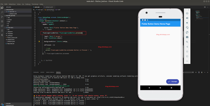
FloatingActionButton.extended constructor
FloatingActionButton.extended({Key key, String tooltip, Color foregroundColor, Color backgroundColor, Color focusColor, Color hoverColor, Object heroTag: const \_DefaultHeroTag(), double elevation, double focusElevation, double hoverElevation, Color splashColor, double highlightElevation, double disabledElevation, @required VoidCallback onPressed, ShapeBorder shape, bool isExtended: true, MaterialTapTargetSize materialTapTargetSize, Clip clipBehavior: Clip.none, FocusNode focusNode, bool autofocus: false, Widget icon, @required Widget label })
Required Parameters
- ‘onPressed’ parameter is required
- ‘label’ parameter is required
 |
|---|
| FloatingActionButton.extended Constructor |
5. ButtonBar Class - Documentation
Also refer official class documentation with this guide to deeply understand the concept.
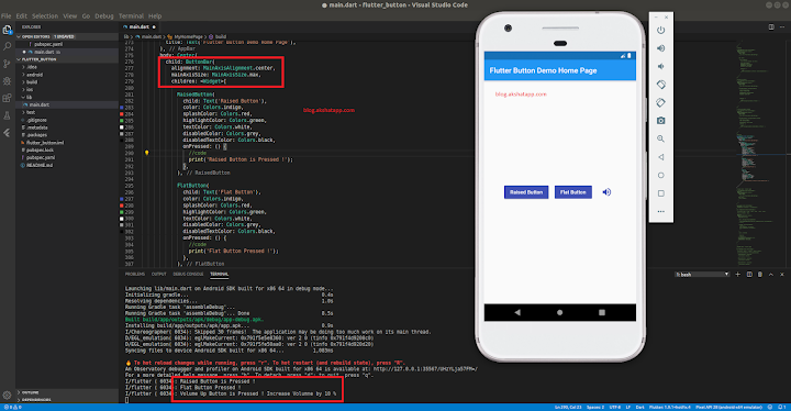
- Use this class when you have to display multiple buttons in a horizontal layout.
- Do not use row widget, instead use ButtonBar class which is designed to acheive such common layouts effectively.
ButtonBar Class Constructor
ButtonBar({Key key, MainAxisAlignment alignment: MainAxisAlignment.end, MainAxisSize mainAxisSize: MainAxisSize.max, List<Widget> children: const [] })
children [] - List of the buttons to be arranged horizontally.
lets add some more parameters or properties : refer official class documentation for property list
- alignment: MainAxisAlignment.center - How the children should be placed along the horizontal axis.
- mainAxisSize: MainAxisSize.max - How much horizontal space is available.
 |
|---|
| ButtonBar Implementation |
6. DropdownButton Class - Documentation
Also refer official class documentation with this guide to deeply understand the concept.
A dropdown button lets the user select from a number of items. Dropdown button allows us build simple input user interface to select list items. Common examples - select countries, currencies, states etc in our flutter app
DropdownButton Class Constructor
DropdownButton({Key key, @required List<DropdownMenuItem<T>> items, T value, Widget hint, Widget disabledHint, @required ValueChanged<T> onChanged, int elevation: 8, TextStyle style, Widget underline, Widget icon, Color iconDisabledColor, Color iconEnabledColor, double iconSize: 24.0, bool isDense: false, bool isExpanded: false })
Required Parameters
- items
Implementation
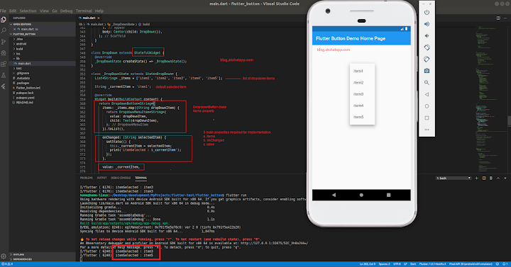
- Create a Dropdown StatefulWidget
- Create a list of dropdown items
- Create a variable for default selected item
-
3 main properties required for DropdownButton class implementation
- items
- onChanged
- value
- items property will contain DropdownMenuItem class implementation as shown below
-
2 main properties required to implement DropdownMenuItem class
- value
- child - Text Widget
 |
|---|
| DropdownButton Class Implementation |
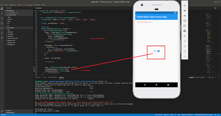
lets add some more parameters or properties : refer official class documentation for property list
icon - The widget to use for the drop-down button’s icon
- iconEnabledColor
- iconDisabledColor
 |
|---|
| DropdownButton Class Properties |
7. PopupMenuButton<T> class - Documentation
Also refer official class documentation with this guide to deeply understand the concept.
When this button is pressed, it displays a menu (pop-up menu).
PopupMenuButton Class Constructor
PopupMenuButton({Key key, @required PopupMenuItemBuilder<T> itemBuilder, T initialValue, PopupMenuItemSelected<T> onSelected, PopupMenuCanceled onCanceled, String tooltip, double elevation, EdgeInsetsGeometry padding: const EdgeInsets.all(8.0), Widget child, Icon icon, Offset offset: Offset.zero, bool enabled: true, ShapeBorder shape, Color color })
Required Parameters
- itemBuilder
Implementation
- Create a list of popup menu items
-
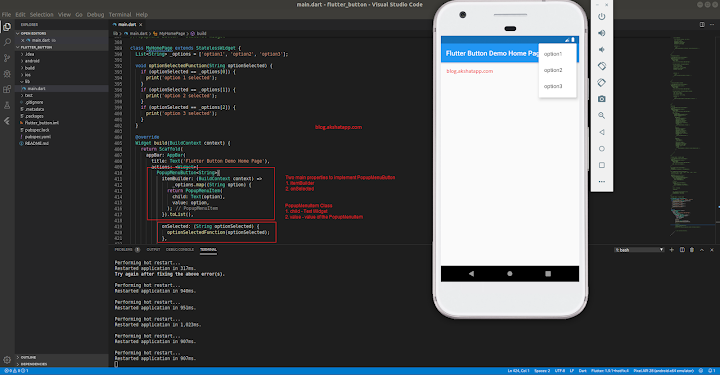
3 main properties required for PopupMenuButton class implementation
- itemBuilder
- onSelected
- itemBuilder property will contain PopupMenuItem class implementation as shown below
-
2 main properties required to implement PopupMenuItem class
- value
- child - Text Widget
 |
|---|
| PopupMenuButton Class Implementation |
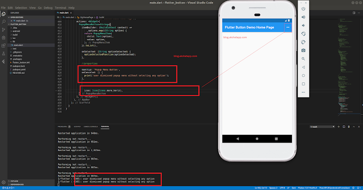
lets add some more parameters or properties : refer official class documentation for property list
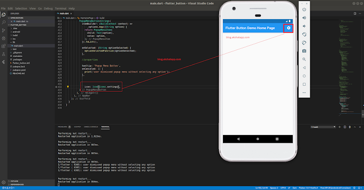
- icon property to change popup menu button
- tooltip - text that describe the action that will occur when the button is pressed
- onCanceled - the function defined here will be called when user dismisses popup menu without selecting any option
 |
|---|
| PopupMenuButton Class Properties |
PopupMenuButton sample implementation - add settings popup menu button
 |
|---|
| Settings PopupMenuButton |
Coding - Sample Flutter App Code
import 'package:flutter/material.dart';

void main() => runApp(MyApp());

class MyApp extends StatelessWidget {
  @override
  Widget build(BuildContext context) {
    return MaterialApp(
      title: 'Flutter Button Demo App',
      debugShowCheckedModeBanner: false,
      theme: ThemeData(
        primarySwatch: Colors.blue,
      ),
      home: MyHomePage(),
    );
  }
}

// 1.FlatButton - Demo

class MyHomePage extends StatelessWidget {
  @override
  Widget build(BuildContext context) {
    return Scaffold(
      appBar: AppBar(
        title: Text('Flutter Button Demo Home Page'),
      ),
      body: Center(
        child: FlatButton(
          child: Text('Flat Button'),
          color: Colors.indigo,
          splashColor: Colors.red,
          highlightColor: Colors.green,
          textColor: Colors.white,
          disabledColor: Colors.grey,
          disabledTextColor: Colors.black,
          onPressed: () {
            //code
            print('Flat Button Pressed !');
          },
        ),
      ),
    );
  }
}

// 2.FlatButton icon constructor

class MyHomePage extends StatelessWidget {
  @override
  Widget build(BuildContext context) {
    return Scaffold(
      appBar: AppBar(
        title: Text('Flutter Button Demo Home Page'),
      ),
      body: Center(
        child: FlatButton.icon(
          icon: Icon(
            Icons.info,
            color: Colors.blue,
          ),
          label: Text('Icon Flat Button'),
          color: Color(0xFFC0C0C0),
          onPressed: () {
            //code
            print('Info Icon Flat Button Pressed !');
          },
        ),
      ),
    );
  }
}

// 3.RaisedButton - Demo

class MyHomePage extends StatelessWidget {
  @override
  Widget build(BuildContext context) {
    return Scaffold(
      appBar: AppBar(
        title: Text('Flutter Button Demo Home Page'),
      ),
      body: Center(
          child: RaisedButton(
        child: Text('Raised Button'),
        color: Colors.indigo,
        splashColor: Colors.red,
        highlightColor: Colors.green,
        textColor: Colors.white,
        disabledColor: Colors.grey,
        disabledTextColor: Colors.black,
        onPressed: () {
          //code
          print('Raised Button is Pressed !');
        },
      )),
    );
  }
}

// 4.RaisedButton icon constructor

class MyHomePage extends StatelessWidget {
  @override
  Widget build(BuildContext context) {
    return Scaffold(
      appBar: AppBar(
        title: Text('Flutter Button Demo Home Page'),
      ),
      body: Center(
          child: RaisedButton.icon(
        icon: Icon(
          Icons.info,
          color: Colors.blue,
        ),
        label: Text('Icon Raised Button'),
        color: Color(0xFFC0C0C0),
        onPressed: () {
          //code
          print('Info Icon Raised Button is Pressed !');
        },
      )),
    );
  }
}

// 5.IconButton - Demo

class MyHomePage extends StatelessWidget {
  @override
  Widget build(BuildContext context) {
    return Scaffold(
      appBar: AppBar(
        title: Text('Flutter Button Demo Home Page'),
      ),
      body: Center(
          child: IconButton(
        icon: Icon(
          Icons.volume_up,
          size: 50.0,
        ),
        color: Colors.indigo,
        splashColor: Colors.red,
        highlightColor: Colors.green,
        disabledColor: Colors.grey,
        focusColor: Colors.orange,
        onPressed: () {
          //code
          print('Volume Up Button is Pressed ! Increase Volumne by 10 % ');
        },
      )),
    );
  }
}

// 6.FloatingActionButton - Demo

class MyHomePage extends StatelessWidget {
  @override
  Widget build(BuildContext context) {
    return Scaffold(
        appBar: AppBar(
          title: Text('Flutter Button Demo Home Page'),
        ),
        floatingActionButton: FloatingActionButton(
          child: Icon(Icons.add),
          tooltip: 'Create or Add',
          backgroundColor: Colors.blue[900],
          splashColor: Colors.green,
          focusColor: Colors.red,
          onPressed: () {
            //code
            print('floating Action Button is Pressed ! ');
          },
        ));
  }
}

// 7.FloatingActionButton extended

class MyHomePage extends StatelessWidget {
  @override
  Widget build(BuildContext context) {
    return Scaffold(
        appBar: AppBar(
          title: Text('Flutter Button Demo Home Page'),
        ),
        floatingActionButton: FloatingActionButton.extended(
          label: Text('I Accept'),
          icon: Icon(Icons.check),
          backgroundColor: Colors.indigo,
          onPressed: () {
            //code
            print('FloatingActionButton.extended Button is Pressed ! ');
          },
        ));
  }
}

// 8.ButtonBar - Demo

class MyHomePage extends StatelessWidget {
  @override
  Widget build(BuildContext context) {
    return Scaffold(
      appBar: AppBar(
        title: Text('Flutter Button Demo Home Page'),
      ),
      body: Center(
        child: ButtonBar(
          alignment: MainAxisAlignment.center,
          mainAxisSize: MainAxisSize.max,
          children: <Widget>[
            RaisedButton(
              child: Text('Raised Button'),
              color: Colors.indigo,
              splashColor: Colors.red,
              highlightColor: Colors.green,
              textColor: Colors.white,
              disabledColor: Colors.grey,
              disabledTextColor: Colors.black,
              onPressed: () {
                //code
                print('Raised Button is Pressed !');
              },
            ),
            FlatButton(
              child: Text('Flat Button'),
              color: Colors.indigo,
              splashColor: Colors.red,
              highlightColor: Colors.green,
              textColor: Colors.white,
              disabledColor: Colors.grey,
              disabledTextColor: Colors.black,
              onPressed: () {
                //code
                print('Flat Button Pressed !');
              },
            ),
            IconButton(
              icon: Icon(
                Icons.volume_up,
                size: 30.0,
              ),
              color: Colors.indigo,
              splashColor: Colors.red,
              highlightColor: Colors.green,
              disabledColor: Colors.grey,
              focusColor: Colors.orange,
              onPressed: () {
                //code
                print(
                    'Volume Up Button is Pressed ! Increase Volumne by 10 % ');
              },
            ),
          ],
        ),
      ),
    );
  }
}

// 9.DropdownButton - Demo [Use Stateful Widget]

class MyHomePage extends StatelessWidget {
  @override
  Widget build(BuildContext context) {
    return Scaffold(
      appBar: AppBar(
        title: Text('Flutter Button Demo Home Page'),
      ),
      body: Center(child: DropDown()),
    );
  }
}
class DropDown extends StatefulWidget {
  @override
  _DropDownState createState() => _DropDownState();
}
class _DropDownState extends State<DropDown> {
  List<String> _items = ['item1', 'item2', 'item3', 'item4', 'item5'];
  String _currentItem = 'item1';
  @override
  Widget build(BuildContext context) {
    return DropdownButton<String>(
      items: _items.map((String dropDownItem) {
        return DropdownMenuItem<String>(
          value: dropDownItem,
          child: Text(dropDownItem),
        );
      }).toList(),
      onChanged: (String selectedItem) {
        setState(() {
          this._currentItem = selectedItem;
          print('itemSelected : $_currentItem');
        });
      },
      value: _currentItem,
      //Properties
      icon: Icon(Icons.arrow_drop_down_circle),
      iconEnabledColor: Colors.blue,
      iconDisabledColor: Colors.grey,
    );
  }
}

// 10.PopupMenuButton - Demo [Use Stateful Widget]

class MyHomePage extends StatelessWidget {
  final List<String> _options = ['option1', 'option2', 'option3'];
  void optionSelectedFunction(String optionSelected) {
    if (optionSelected == _options[0]) {
      print('option 1 selected');
    }
    if (optionSelected == _options[1]) {
      print('option 2 selected');
    }
    if (optionSelected == _options[2]) {
      print('option 3 selected');
    }
  }
  @override
  Widget build(BuildContext context) {
    return Scaffold(
      appBar: AppBar(
        title: Text('Flutter Button Demo Home Page'),
        actions: <Widget>[
          PopupMenuButton<String>(
            itemBuilder: (BuildContext context) =>
                _options.map((String option) {
              return PopupMenuItem(
                child: Text(option),
                value: option,
              );
            }).toList(),
            onSelected: (String optionSelected) {
              optionSelectedFunction(optionSelected);
            },
            //properties
            tooltip: 'Popup Menu Button',
            onCanceled: () {
              print('user dismissed popup menu without selecting any option');
            },
            icon: Icon(Icons.settings),
          )
        ],
      ),
    );
  }
}
Bonus Tip : Also refer the following classes to improve your PopupMenu UI
- PopupMenuDivider - a popup menu entry that is just a horizontal line - Documentation
- CheckedPopupMenuItem - a popup menu item with a checkmark - Documentation
There are two more classes using which we can implement button functionality
- GestureDetector Class
- InkWell Class
We will cover this in Flutter Gestures Guide.
Frequently Asked Questions
Share This Post

Join our newsletter!
Get the latest developer guides, tutorials, and tips delivered straight to your inbox.